Visual identity
Logo system, color palette, typography, iconography, photography, illustration, and dark mode, with an integration test.
22 min read · Free to copy and adapt · CC0
Revised . Game-data examples revised with rules and denominators. Check the content inside reused artwork as well as its visual treatment.
Download this chapter (.md)This chapter defines the visual system for Playbook RG – the logo, colors, typography, iconography, photography, and illustration guidelines that make the brand recognizable across every touchpoint.
The visual quality rule: Playbook content must match or exceed the production quality of the operator’s commercial marketing. If the RG content looks cheaper, older, or more generic than the promotional content around it, players will treat it like fine print. Design it like you’d design a product launch – because that’s what it is.
The adaptive identity model: Playbook RG is designed to be recognizable but adaptive. Operators apply their own colors and fonts while keeping the structural identity (layout patterns, information hierarchy, icon system, spacing) consistent. A player who encounters Playbook-based content at one platform will intuitively recognize the content structure at another – even though they look different.
All color values, fonts, and specifications reference the central configuration in
_brand.yml. Update that file to customize the visual identity for your organization.
1. Logo system
Logo purpose
The Playbook RG logo identifies gambling entertainment literacy content. It signals to players: “This is where you get smarter about the game.” The logo should feel modern, confident, and premium – like it belongs on a lifestyle brand, not a government pamphlet.
Logo design
The Playbook RG logo is a text-based wordmark that splits “Playbook” into its two component concepts:
- Play – set in Inter 800 (bold). Represents the entertainment side of gambling.
- book – set in Inter 300 (light), uppercase, letter-spaced. Represents the knowledge and literacy side.
The weight contrast between the two halves embodies the brand’s core duality: enjoying the game and understanding it.
Logo layouts
Scroll sideways for all columns. With a keyboard, focus this table area and use the left and right arrow keys. Tab moves to the next control.
| Layout | Name | Best for |
|---|---|---|
| Stacked (B1) | Play over BOOK, two lines | App icons, social avatars, square formats, hero placements |
| Horizontal (B2) | Playbook as one word | Navigation bars, headers, banners, inline references, small sizes |
Both layouts are interchangeable – choose based on the available space and aspect ratio.
Usage rules
Clear space
Maintain a minimum clear space equal to 1x the height of the logomark on all sides. No text, imagery, or other visual elements should intrude into this space.
    ┌────────────────────────────────┐
    │          clear space           │
    │    ┌──────────────────┐       │
    │    │                  │       │
    │    │   [LOGO HERE]    │       │
    │    │                  │       │
    │    └──────────────────┘       │
    │          clear space           │
    └────────────────────────────────┘

    ← 1x →│    logo    │← 1x →
Minimum size
- Print: Minimum 0.25 inches (6.35mm) in height
- Digital: Minimum 24px in height
- Below these sizes, use the logomark only (no wordmark)
Approved color variants
Each layout (stacked and horizontal) is available in 5 color modes:
Scroll sideways for all columns. With a keyboard, focus this table area and use the left and right arrow keys. Tab moves to the next control.
| Variant | Play color | Book color | Background | File suffix |
|---|---|---|---|---|
| Full color | primary navy | primary navy | White | -full-color |
| On light | primary navy | secondary_dark teal | neutral_50 light | -on-light |
| Reversed | White | secondary teal | primary navy | -reversed |
| Mono white | White | neutral_300 | Black / dark | -mono-white |
| Mono dark | primary navy | primary navy | Light (single-color) | -mono-dark |
Logo files
visual-identity/logo/
  primary/                          ← default use
    logo-stacked-full-color.svg
    logo-stacked-on-light.svg
    logo-horizontal-full-color.svg
    logo-horizontal-on-light.svg
  secondary/                        ← dark backgrounds, mono
    logo-stacked-reversed.svg
    logo-stacked-mono-white.svg
    logo-stacked-mono-dark.svg
    logo-horizontal-reversed.svg
    logo-horizontal-mono-white.svg
    logo-horizontal-mono-dark.svg
  favicon/
    favicon.svg
    favicon-reversed.svg
    favicon-mono-white.svg
  helpline-badge/
    helpline-badge-light.svg
    helpline-badge-dark.svg
Regenerate all logo files: node collateral/render/build-logos.mjs
Logo previews
Primary layouts:
Scroll sideways for all columns. With a keyboard, focus this table area and use the left and right arrow keys. Tab moves to the next control.
| Stacked | Horizontal |
|---|---|
 |  |
 |  |
Secondary layouts:
Scroll sideways for all columns. With a keyboard, focus this table area and use the left and right arrow keys. Tab moves to the next control.
| Stacked | Horizontal |
|---|---|
 |  |
 |  |
 |  |
Favicon and helpline badge:
Scroll sideways for all columns. With a keyboard, focus this table area and use the left and right arrow keys. Tab moves to the next control.
| Favicon | Favicon reversed | Helpline light | Helpline dark |
|---|---|---|---|
 |  |  |  |
Prohibited modifications
Do not:
- Stretch, compress, or distort the logo
- Rotate the logo
- Apply drop shadows, outlines, or effects
- Change the logo colors outside of approved variants
- Place the logo on busy or low-contrast backgrounds
- Recreate or approximate the logo using other fonts or shapes
- Animate the logo in ways that compromise legibility
- Place the logo inside an unapproved container or shape
Co-branding
When the Playbook RG logo appears alongside an operator’s logo:
- Both logos maintain their respective clear space
- The Playbook RG logo should be no smaller than 60% of the operator logo’s height
- Use a vertical divider line (
neutral_300color, 1px) between logos when they appear side by side - The operator logo typically appears first (left or top), with Playbook RG second (right or bottom)
- The co-branding lockup should feel like two peers side by side – not a primary brand and its subordinate
Helpline badge lockup
A special lockup combines the Playbook RG logomark with a helpline number for contexts where regulatory requirements mandate displaying support information alongside branding:
[Logomark] | Call for support: [local support number]Replace the example number with the actual local call route. Include the service’s confirmed hours, eligibility and any required wording; do not infer text/chat availability, cost or privacy from the phone number. Inspect the wording inside any existing badge artwork before reuse.
Specifications for the helpline badge are in visual-identity/logo/helpline-badge/.
Need production files?
Browse the source lockups and favicons. The support badges below are editable reference files: add a verified local call number before use.
2. Color palette
Design philosophy
The default Playbook RG palette is built for a modern, entertainment-grade aesthetic. It should feel like it belongs on a gaming platform, not a health website. Deep navy conveys authority and sophistication. Electric teal creates energy and modernity. Bold orange drives action and attention.
The palette avoids the washed-out blues and clinical greens common in traditional RG programs. This is a lifestyle brand palette – confident, contemporary, and high-impact.
Primary palette
Scroll sideways for all columns. With a keyboard, focus this table area and use the left and right arrow keys. Tab moves to the next control.
| Role | Color | Hex | Usage |
|---|---|---|---|
| Primary | Deep navy | #1B2838 | Brand identification, headers, backgrounds |
| Primary light | Navy | #2A3F56 | Hover states, secondary elements |
| Primary dark | Midnight | #0F1923 | High-contrast text on light backgrounds |
Secondary palette
Scroll sideways for all columns. With a keyboard, focus this table area and use the left and right arrow keys. Tab moves to the next control.
| Role | Color | Hex | Usage |
|---|---|---|---|
| Secondary | Electric teal | #00D4AA | Interactive elements, links, highlights |
| Secondary light | Light teal | #33DDBB | Hover states, subtle highlights |
| Secondary dark | Dark teal | #00A888 | Pressed states, secondary text on light backgrounds |
Accent palette
Scroll sideways for all columns. With a keyboard, focus this table area and use the left and right arrow keys. Tab moves to the next control.
| Role | Color | Hex | Usage |
|---|---|---|---|
| Accent | Bold orange | #FF6B35 | Primary CTAs, attention, action buttons |
| Accent light | Light orange | #FF8A5C | Hover states, secondary CTAs |
| Accent dark | Dark orange | #E55A2B | Pressed states, high-contrast accent |
Semantic palette
These colors communicate specific states and should be used consistently across all interfaces:
Scroll sideways for all columns. With a keyboard, focus this table area and use the left and right arrow keys. Tab moves to the next control.
| Role | Color | Hex | Usage |
|---|---|---|---|
| Success | Green | #00C853 | Quiz passed, limit set, positive confirmation |
| Warning | Amber | #FFB300 | Approaching limit, session reminder |
| Danger | Red | #FF3D00 | Tier 2 only – critical alerts, self-exclusion |
| Info | Blue | #2979FF | Informational content, tips, explainers |
Neutral palette
Scroll sideways for all columns. With a keyboard, focus this table area and use the left and right arrow keys. Tab moves to the next control.
| Role | Hex | Usage |
|---|---|---|
neutral_900 | #1A1A2E | Primary text |
neutral_700 | #3D3D5C | Secondary text |
neutral_500 | #6B6B8A | Placeholder text, captions, metadata |
neutral_300 | #A8A8C0 | Borders, dividers |
neutral_100 | #E8E8F0 | Card backgrounds, table stripes |
neutral_50 | #F5F5FA | Page backgrounds |
| White | #FFFFFF | Surface backgrounds |
| Black | #111111 | Maximum contrast text (use sparingly) |
Color accessibility
Every foreground/background combination used in Playbook RG must meet WCAG 2.1 AA contrast requirements:
- Normal text (under 18px or under 14px bold): minimum 4.5:1 contrast ratio
- Large text (18px+ or 14px+ bold): minimum 3:1 contrast ratio
- UI components and graphical objects: minimum 3:1 contrast ratio
See visual-identity/color/accessibility-matrix.md for the complete contrast ratio matrix.
Adapting colors for your brand
When customizing the palette:
- Replace primary/secondary/accent colors with your brand colors
- Keep the semantic palette (success/warning/danger/info) standard – players learn these associations
- Verify every new color combination against WCAG 2.1 AA
- Your Playbook content should feel visually integrated with your commercial brand, not siloed into a separate “RG section” aesthetic
- Update all values in
_brand.ymlso they cascade throughout the system
Primary#1B2838
Primary light#2A3F56
Secondary#00D4AA
Secondary dark#00A888
Accent#FF6B35
Accent light#FF8A5C
Neutral 50#F5F5FA
Neutral 900#1A1A2E
3. Typography
Type system
The default type system uses open-source variable fonts from Google Fonts – broad availability, zero licensing cost, modern aesthetic. Self-hosted woff2 files are included for production use.
Scroll sideways for all columns. With a keyboard, focus this table area and use the left and right arrow keys. Tab moves to the next control.
| Role | Family | Weight(s) | Usage |
|---|---|---|---|
| Headings, UI, logo | Inter | 300, 400, 600, 700, 800, 900 | Headlines, section headers, card headings, quiz questions, logo, labels, CTAs |
| Body text | Source Sans 3 | 300, 400, 600 | Paragraph text, descriptions, form labels |
| Data, odds, helplines | Source Code Pro | 400, 500, 600 | Helpline numbers (character disambiguation), odds displays, data, RTP values |
Why these fonts? Inter has excellent screen readability and the broad weight range needed for the logo (800 vs 300 contrast). Source Code Pro disambiguates 0/O and 1/l/I – critical for helpline numbers.
Type scale
Based on a 16px base (1rem):
Scroll sideways for all columns. With a keyboard, focus this table area and use the left and right arrow keys. Tab moves to the next control.
| Level | Size (rem) | Size (px) | Weight | Leading | Tracking | CSS class |
|---|---|---|---|---|---|---|
| Display | 3.0 | 48 | 700 | 1.2 | -0.02em | .pb-display |
| H1 | 2.5 | 40 | 700 | 1.2 | -0.02em | .pb-h1 |
| H2 | 2.0 | 32 | 600 | 1.2 | 0 | .pb-h2 |
| H3 | 1.5 | 24 | 600 | 1.3 | 0 | .pb-h3 |
| H4 | 1.25 | 20 | 600 | 1.3 | 0 | .pb-h4 |
| Body large | 1.125 | 18 | 400 | 1.6 | 0 | .pb-body-lg |
| Body | 1.0 | 16 | 400 | 1.6 | 0 | .pb-body |
| Small | 0.875 | 14 | 400 | 1.6 | 0 | .pb-small |
| Caption | 0.75 | 12 | 400 | 1.5 | 0 | .pb-caption |
Headings scale down on mobile (≤768px): Display→36px, H1→32px, H2→24px, H3→20px, H4→18px. Body sizes stay fixed.
Font weights
Scroll sideways for all columns. With a keyboard, focus this table area and use the left and right arrow keys. Tab moves to the next control.
| Name | Value | Token | Primary usage |
|---|---|---|---|
| Light | 300 | --pb-weight-light | Logo “BOOK” half, body light |
| Regular | 400 | --pb-weight-regular | Body text, form labels |
| Medium | 500 | --pb-weight-medium | Mono data displays, odds |
| Semibold | 600 | --pb-weight-semibold | H2–H4, CTAs, labels, UI elements |
| Bold | 700 | --pb-weight-bold | H1, Display headlines, helpline numbers |
| Extrabold | 800 | --pb-weight-extrabold | Logo “Play” half, hero statistics |
| Black | 900 | --pb-weight-black | Campaign accent headlines |
Semantic type classes
The drop-in CSS (playbook-typography.css) provides purpose-built classes for common Playbook content patterns:
Scroll sideways for all columns. With a keyboard, focus this table area and use the left and right arrow keys. Tab moves to the next control.
| Class | Description | Example |
|---|---|---|
.pb-stat | Hero data number (Inter 800, 48px) | “5.26% – double-zero roulette, standard payouts, basket excluded” |
.pb-odds | Odds display (Source Code Pro 500, 24px) | “1 in 37 – one specified number on a uniform single-zero wheel” |
.pb-quiz-question | Quiz heading (Inter 700, 24px) | “What does house edge mean?” |
.pb-helpline | Helpline number (Source Code Pro 600, 18px) | ”[local support number] – replace with the actual local call route” |
.pb-cta | Button text (Inter 600, 16px) | “Take the quiz” |
.pb-label | Uppercase label (Inter 600, 14px) | “HOUSE EDGE” |
.pb-eyebrow | Tiny uppercase (Inter 600, 12px) | “MYTH BUSTER” |
Typography rules
- Minimum body text size: 16px (1rem). No exceptions. Accessibility requires it, and content people are supposed to read should be readable.
- Line length: 50–75 characters per line for body text. Wider reduces readability.
- Paragraph spacing: 1em (one blank line) between paragraphs.
- Left-aligned text: Always. Justified text creates uneven word spacing.
- Helpline numbers: Always in
.pb-helpline(Source Code Pro 600). Never use a font where 1/l/I or 0/O are ambiguous. - Caption text (12px): Legal lines only. Never for content players should read.
Typography files
visual-identity/typography/
  playbook-typography.css       ← drop-in CSS (self-hosted @font-face + classes)
  type-specimen.html            ← visual reference page
  typography.md                 ← detailed reference documentation
  fonts/
    inter-latin.woff2           ← variable weight 300–900
    source-sans-3-latin.woff2   ← variable weight 300–600
    source-code-pro-latin.woff2 ← variable weight 400–600
Adapting typography
When customizing fonts:
- Choose fonts with broad weight support (minimum: regular and bold)
- Match the quality and modernity of your operator’s commercial typography
- Ensure the font supports character sets for your operating jurisdictions
- Test readability at small sizes – Playbook content often appears in constrained spaces
- If replacing Inter, ensure your heading font has weight ≥700 for the logo and ≤300 for the “BOOK” contrast
- Update
_brand.ymland regenerateplaybook-typography.css
4. Iconography
Design philosophy: Weight contrast
The Playbook RG icon system mirrors the logo’s typographic contrast – Play (800 weight) vs BOOK (300 weight) – through a dual stroke-weight system. Every icon contains two visual layers:
- Primary strokes (2px): Outer containers, main shapes, defining structure – the “Play” weight
- Detail strokes (1px): Inner details, accents, secondary elements – the “BOOK” weight
This 2:1 ratio creates visual hierarchy within each icon and ties the icon system to the wordmark’s design language. The weight contrast is visible at 24px and still perceptible at 16px.
Icon specifications
Scroll sideways for all columns. With a keyboard, focus this table area and use the left and right arrow keys. Tab moves to the next control.
| Property | Value |
|---|---|
| Style | Weight-contrast outlined (dual stroke) |
| Primary stroke | 2px – containers, structure |
| Detail stroke | 1px – accents, inner elements |
| Stroke color | currentColor (inherits from parent) |
| Fill | none |
| Line cap | Round |
| Line join | Round |
| Canvas size | 24x24px |
| Optical sizes | 16px, 24px, 32px, 48px |
SVG structure – no stroke-width on root; weights set on <g> groups:
<svg ... fill="none" stroke="currentColor"
     stroke-linecap="round" stroke-linejoin="round">
  <g stroke-width="2"><!-- containers --></g>
  <g stroke-width="1"><!-- details --></g>
</svg>
Icon library (31 icons across 6 categories)
Game Types (7)
Scroll sideways for all columns. With a keyboard, focus this table area and use the left and right arrow keys. Tab moves to the next control.
| Icon | Name | Primary (2px) | Detail (1px) | Usage |
|---|---|---|---|---|
| Playing cards | icon-cards | Two card outlines | Suit symbol | Card games, blackjack |
| Dice | icon-dice | Two die outlines | Pip dots | Dice games, craps |
| Roulette wheel | icon-roulette | Outer + inner circles | 8 spokes, ball, pointer | Roulette, casino games |
| Slot machine | icon-slots | Machine body | Reel windows, lever | Slot machines |
| Sports ball | icon-sports | Ball circle | Horizontal + inward arcs | Sports betting |
| Lottery ticket | icon-lottery | Ticket outline | Tear line, star | Lottery, scratch cards |
| Table | icon-table | Table arc + rail | Dealer/player dots | Table games, baccarat |
Odds & Math (4)
Scroll sideways for all columns. With a keyboard, focus this table area and use the left and right arrow keys. Tab moves to the next control.
| Icon | Name | Primary (2px) | Detail (1px) | Usage |
|---|---|---|---|---|
| Percent circle | icon-percentage | Circle | Percent slash + dots | Probabilities, return rates |
| Comparison bars | icon-edge | Two bars (tall/short) | Baseline, hash marks | House edge, advantage |
| Shuffle arrows | icon-rng | Crossing paths | Arrowheads | RNG; explain independence only where the game model supports it |
| Equal circle | icon-equal | Circle | Equal-sign lines | Equal probability, fairness |
Player Tools (7)
Scroll sideways for all columns. With a keyboard, focus this table area and use the left and right arrow keys. Tab moves to the next control.
| Icon | Name | Primary (2px) | Detail (1px) | Usage |
|---|---|---|---|---|
| Timer | icon-timer | Clock circle | Hands, knob | Session awareness |
| Gauge | icon-limit | Gauge arc | Needle, ticks | Deposit/loss/wager limits |
| Dollar circle | icon-budget | Circle | Dollar sign | Entertainment budget |
| Bell | icon-bell | Bell body | Clapper | Notifications, reminders |
| Clock arrow | icon-history | Clock circle | Hands, rewind arrow | Play history, session log |
| Check box | icon-check | Rounded rectangle | Checkmark | Confirmation |
| Bar chart | icon-activity | Chart axes | Bar lines | Activity tracking, stats |
Content & Education (4)
Scroll sideways for all columns. With a keyboard, focus this table area and use the left and right arrow keys. Tab moves to the next control.
| Icon | Name | Primary (2px) | Detail (1px) | Usage |
|---|---|---|---|---|
| Question circle | icon-quiz | Circle | Question mark + dot | Quizzes, knowledge tests |
| X-mark circle | icon-myth | Circle | X-mark lines | Myth-busting |
| Check circle | icon-fact | Circle | Checkmark | Facts, verified info |
| Info circle | icon-info | Circle | i-dot + i-stem | Tips, explainers |
Social & Sharing (4)
Scroll sideways for all columns. With a keyboard, focus this table area and use the left and right arrow keys. Tab moves to the next control.
| Icon | Name | Primary (2px) | Detail (1px) | Usage |
|---|---|---|---|---|
| Share arrow | icon-share | Box container | Arrow shaft + head | Social sharing |
| Crossed swords | icon-challenge | Two diagonals | Handle/hilt lines | Challenges, versus mode |
| Trophy | icon-score | Trophy cup | Handles, stem, base | Achievements, scores |
| QR code | icon-qr | 3 finder blocks | Inner rects, data lines | QR codes, mobile linking |
Support & Safety (5)
Scroll sideways for all columns. With a keyboard, focus this table area and use the left and right arrow keys. Tab moves to the next control.
| Icon | Name | Primary (2px) | Detail (1px) | Usage |
|---|---|---|---|---|
| Phone | icon-phone | Phone body | Signal arcs | Helpline, support |
| Warning triangle | icon-warning | Triangle outline | Exclamation + dot | Warnings, caution |
| First-aid cross | icon-help | Circle | Plus cross | Help resources, crisis lines |
| External arrow | icon-external | Box | Arrow + diagonal | External links |
| Playbook | icon-playbook | Open book + spine | Play triangle | Brand identifier, home |
See visual-identity/iconography/icon-library.md for the complete spec, visual-identity/iconography/icon-preview.html for a visual preview at 16/24/32/48px, and visual-identity/iconography/icons/ for the 31 SVG source files.
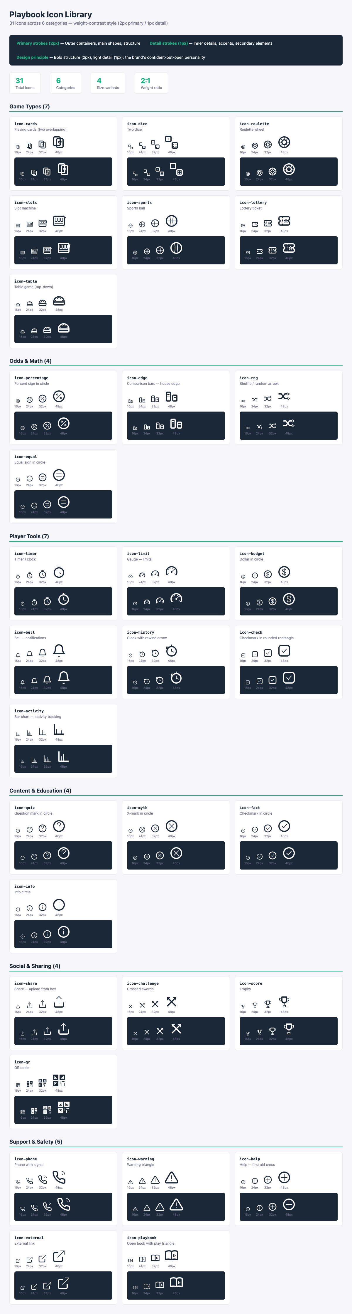
5. Photography
Photo direction
Photography in Playbook RG materials should feel like a lifestyle editorial – real people enjoying themselves, shot with natural light and confident energy. The vibe is “people who enjoy life and make smart choices” – not “people who might have a problem.”
Do
- Show real, diverse people having a good time – at sports events, with friends, checking their phones casually
- Use natural lighting – warm, energetic, and inviting
- Capture social moments – friends watching a game, group celebrations, shared experiences
- Show confident, relaxed body language – people who are in control and enjoying themselves
- Represent diverse ages, ethnicities, genders, and abilities
- Use candid, authentic-feeling shots – editorial quality, not stock photo sterility
Don’t
- Show people who look distressed, defeated, or desperate
- Use stereotypical “problem gambler” imagery (head in hands, empty wallet, dark rooms)
- Show generic, lifeless stock photography that looks like it came from a compliance department
- Show alcohol consumption alongside gambling education content
- Use images of minors
- Avoid imagery that’s too staged or corporate – this should feel real
The gambling environment question
Unlike traditional RG programs that avoid all gambling imagery, Playbook takes a different approach:
- Casino environments: Can appear if the mood is social, fun, and energetic – people enjoying a night out. Not dim rooms with solitary players.
- Sports contexts: Encouraged – friends watching games, stadium energy, sports culture
- Mobile/digital: People casually checking phones, using apps – relaxed, everyday settings
- Avoid: Close-ups of money, chips, or betting slips used in a way that glamorizes high-stakes play
The key question: “Does this image make gambling look like fun entertainment among friends, or does it make it look like an isolated, high-stakes activity?” Go with the former.
Mood board keywords
When sourcing or commissioning photography:
- Confidence, enjoyment, social energy
- Smart choices, good times, living well
- Diversity, inclusion, real people
- Modern lifestyle, urban, contemporary
- Sports culture, entertainment, nightlife
6. Illustration
When to use illustration
Illustrations complement photography in contexts where:
- Explaining abstract concepts (odds, probability, house edge, RNG)
- Creating educational content (myth-busting, how-it-works)
- Building quiz and interactive content visuals
- Social media graphics that need to stand out
Illustration style
Scroll sideways for all columns. With a keyboard, focus this table area and use the left and right arrow keys. Tab moves to the next control.
| Property | Guideline |
|---|---|
| Style | Flat or semi-flat, with subtle gradients – modern and clean |
| Line weight | Consistent, moderate (similar to icon stroke weight) |
| Color | Use brand palette – primary, secondary, and accent |
| People | Simplified, inclusive, diverse – non-photorealistic |
| Mood | Confident, clear, smart – never cutesy or childish |
| Complexity | Simple enough to read at small sizes; detailed enough to be engaging |
Data visualization
For educational content (odds, probabilities, house edge comparisons):
- Use the brand palette for charts and graphs
- Always label clearly – no assumptions about player knowledge
- Make the key insight obvious at a glance
- Add context: “Standard single-zero roulette bets without a zero concession have 2.70% house edge; standard double-zero bets have 5.26%, excluding the five-number basket.” Name the stake denominator and link the full roulette comparison.
- Keep the rules and denominator in the graphic itself. If those conditions cannot fit, shorten the claim or use a more suitable format. A source link does not make an unqualified number self-explanatory.
7. Dark mode
When the operator’s platform supports dark mode, the Playbook RG color system should adapt. Dark mode isn’t just an inverted light mode – it requires intentional color mapping to maintain readability, hierarchy, and brand identity.
When to auto-switch
Scroll sideways for all columns. With a keyboard, focus this table area and use the left and right arrow keys. Tab moves to the next control.
| Trigger | Behavior |
|---|---|
System preference (prefers-color-scheme: dark) | Auto-switch to dark mode. This is the default. |
| User toggle in-app | Override system preference. Persist the choice. |
| Scheduled (sunrise/sunset) | Only if the operator’s platform supports it. |
| Tier 2 support pages | Always use light mode – dark mode can feel isolating in crisis contexts. |
Rule: Never force dark mode. Always respect the user’s system preference unless they’ve explicitly toggled within the app.
Semantic color mapping
Scroll sideways for all columns. With a keyboard, focus this table area and use the left and right arrow keys. Tab moves to the next control.
| Token | Light mode | Dark mode | Ratio on dark bg |
|---|---|---|---|
background | neutral_50 (#F5F5FA) | neutral_900 (#1A1A2E) | – |
surface | white (#FFFFFF) | neutral_700 (#3D3D5C) | – |
text_primary | neutral_900 (#1A1A2E) | neutral_50 (#F5F5FA) | 15.70:1 ✓ |
text_secondary | neutral_700 (#3D3D5C) | neutral_300 (#A8A8C0) | 7.33:1 ✓ |
text_muted | neutral_500 (#6B6B8A) | neutral_500 (#6B6B8A) | 3.33:1 (large text only) |
headers | primary (#1B2838) | primary_light (#2A3F56) | – |
link | primary_light (#2A3F56) | secondary (#00D4AA) | 8.93:1 ✓ |
border | neutral_500 (#6B6B8A) | neutral_700 (#3D3D5C) | – |
accent (CTA) | accent (#FF6B35) | accent_light (#FF8A5C) | 7.34:1 ✓ |
secondary (CTA) | secondary_dark (#00A888) | secondary (#00D4AA) | 8.93:1 ✓ |
Note on muted text in dark mode: neutral_500 on neutral_900 produces only 3.33:1 – this passes for large text (3:1 threshold) but fails AA normal text (4.5:1). Use muted text sparingly in dark mode, and only at 18px+ or 14px+ bold.
Semantic status colors in dark mode
Status colors (success, warning, danger, info) need adjustment for dark backgrounds:
Scroll sideways for all columns. With a keyboard, focus this table area and use the left and right arrow keys. Tab moves to the next control.
| Status | Light mode | Dark mode | Dark mode text | Ratio |
|---|---|---|---|---|
| Success | #00C853 bg + primary text | #00C853 bg + primary text | Same – dark text on green | 6.67:1 ✓ |
| Warning | #FFB300 bg + primary text | #FFB300 bg + primary text | Same – dark text on amber | 8.31:1 ✓ |
| Danger | #FF3D00 bg + black text | #FF3D00 bg + black text | Same – dark text on red | 5.32:1 ✓ |
| Info | #2979FF bg + black text | #2979FF bg + black text | Same – dark text on blue | 4.74:1 ✓ |
Rule of thumb: Always use dark text on chromatic status backgrounds, in both light and dark mode. Never use white text on these colors.
Image and media treatment
Scroll sideways for all columns. With a keyboard, focus this table area and use the left and right arrow keys. Tab moves to the next control.
| Asset type | Dark mode treatment |
|---|---|
| Photographs | Reduce brightness to 85-90% to prevent glare on dark backgrounds |
| Illustrations / icons | Use light-on-dark variants (swap stroke and fill colors) |
| Charts / data viz | Use light text and grid lines; reduce opacity of non-essential elements |
| Screenshots | Add a subtle border (neutral_700, 1px) so edges don’t bleed into the background |
| Brand gradient bar | No change – the orange → teal gradient works on both light and dark |
CSS implementation
@media (prefers-color-scheme: dark) {
  :root {
    --pb-bg: #1A1A2E;
    --pb-surface: #3D3D5C;
    --pb-text-primary: #F5F5FA;
    --pb-text-secondary: #A8A8C0;
    --pb-text-muted: #6B6B8A;
    --pb-border: #3D3D5C;
    --pb-link: #00D4AA;
    --pb-accent: #FF8A5C;
  }

  img:not([src*=".svg"]) {
    filter: brightness(0.88);
  }
}
Operators using _brand.yml can override these tokens. The CSS custom property names use the --pb- prefix (short for Playbook) to avoid collisions with operator stylesheets.
Testing requirements
- Test with system dark mode on macOS, Windows, iOS, and Android
- Verify all text meets WCAG 2.1 AA contrast on dark backgrounds
- Check that images don’t glare or blow out on dark surfaces
- Confirm the user’s preference persists across sessions
- Verify Tier 2 pages remain in light mode regardless of system setting
- Test the transition animation between modes (prefer
150ms ease-outonbackground-colorandcolor)
All dark mode combinations must pass WCAG 2.1 AA contrast requirements. See visual-identity/color/accessibility-matrix.md for the full contrast ratio matrix on dark backgrounds.
Light surface
Know your game.
The odds do not change with the theme. Contrast, hierarchy, and meaning stay intact.
Single-zero roulette · standard payouts
2.70% house edge
Dark surface
Know your game.
The odds do not change with the theme. Contrast, hierarchy, and meaning stay intact.
Single-zero roulette · standard payouts
2.70% house edge
8. The visual integration test
Before shipping any Playbook content, apply this test:
- Place it next to the operator’s commercial content. Does it look like it belongs, or does it look like it was bolted on from a different brand?
- Would a CMO put their name on this? If it looks like a compliance department made it, redesign.
- Does it feel modern? If it could have been designed in 2010, it’s not good enough.
- Is it accessible? Run the contrast ratios. Check the touch targets. Test with a screen reader.
If it passes all four, ship it.
What it looks like
A curated selection of rendered templates showing the visual identity in action. Click the template name to view the full HTML source. See collateral/render/ for all 36 templates.
Tier 1 – Entertainment literacy
Scroll sideways for all columns. With a keyboard, focus this table area and use the left and right arrow keys. Tab moves to the next control.
| Category | Template | Preview |
|---|---|---|
| Social card | Hot streak myth-buster |  |
| Story | Hot streak story |  |
| Poster | Know Your Game |  |
| Welcome series |  | |
| Venue sign | Entrance sign |  |
| Rack card |  | |
| Digital display | Landscape display |  |
Tier 2 – Support and crisis
Scroll sideways for all columns. With a keyboard, focus this table area and use the left and right arrow keys. Tab moves to the next control.
| Category | Template | Preview |
|---|---|---|
| Support page | Help/support landing |  |
| Self-exclusion | Pause account flow |  |
| Poster | Venue helpline poster |  |
See the Tier 2 Visual Guide for the full visual specification and all 8 Tier 2 template previews.
Previous: Chapter 2 – Brand Personality | Next: Chapter 4 – Voice and Tone
Game-example sources and scope
Use the game guides and glossary for the full assumptions behind these examples. The roulette analysis explains wheel, payout and bet exceptions; the RTP explanation distinguishes machine mechanisms within its British scope. The worked arithmetic is illustrative and uses a stated wager denominator. A source or quiz result does not establish an individual player’s outcome.
Confirm actual game rules and service details before adapting the copy. Preserve material conditions when shortening or translating it. Check numbers inside images and downloadable artwork as well as the surrounding text.